

Austin Humane Society
Responsive Non-Profit Website Redesign
— Overview
This responsive non-profit redesign features a spacious experience and clear navigation. In a team of four, I conducted user research, analyzed data for ideation, and designed page flows in Adobe XD.
Our goal was to ease the overwhelm of locating the main engagement options. This intuitive and friendly experience is for people visiting the humane society interested in:
Adoption: searching for and viewing a pet profile
Donation: inputting desired amount and proceeding with payment
Fostering: understanding how it works and submitting a request
Volunteering: learning what steps to take with an option to apply
— The Problem
The four major purposes of this website (adopt, donate, foster, volunteer) are hard to find. People visiting are unable to effectively navigate with the overwhelming amount of content.
“How might we support intuitive and successful navigation for animal-lovers who seek information?”
My Roles
UX Researcher
Information Architect
Ideation
UI Designer
The Team
Rio Bell
Megan Gloetzner
Grady McGee
Lauren Boone
Our Tools
Adobe XD
Adobe Photoshop
Invision
Miro
— The Solution
Spacious content + clear navigation = increased discoverability.
People will feel more confident in reaching their destination with three primary solutions:
simplify the navigation and page structure for discoverability
use fewer words and more imagery to create a more breathable and direct layout
merge content to reduce the number of clicks to reach the intended page
— The Process

1. Empathize
SWOT & Competitor Analysis
Heuristic Evaluation
Survey & Interviews
2. Define
User Persona
Feature Prioritization Matrix
User Insight
3. Ideate
Storyboard
Sketches & Wireframes
User Task Flow
4. Prototype & Test
Low-Fidelity Mockups & Testing
High-Fidelity Prototype
1. Empathize
To begin to understand the users' environment we conducted a SWOT & competitor analysis. Then I analyzed their current usability experience by performing a heuristic evaluation. Afterward, I further empathized with our users through a survey and interviews.
— SWOT & Competitor Analysis
SWOT (Strengths, Weaknesses, Opportunities, Threats)
This assessment highlighted that the Austin Humane Society has a strong color palette. Their UI style is central to their identity.
It also showed that the platform feels dated, busy, and inconsistent navigating pages.


Competitor Analysis
Researching direct and indirect competitors revealed that local organizations have desirable online features.
Competitors often use modern designs and brand recognition to their advantage.
— Heuristic Evaluation
This heuristic evaluation measures and records the interface usability issues we can correct.
The analysis showed:
the buttons are inconsistent throughout
there is no search bar for site navigation
there is little white space and excessive wording

Click to open file in a new window
— Survey & Interviews
To discover and understand our users I conducted a survey and interviews. This allowed me to define demographics, behaviors, and motives.
5 User Interviews | 44 Survey Respondents
I learned that the majority of people search for essential resources online. The most frequent feedback was that they found it difficult to find what they were looking for.
This confirmed the importance of having spacious content and clear navigation.

2. Define
From our qualitative and quantitative research, I established our user persona, Andrea. To determine what would give her the most value I built a feature prioritization matrix. With this in mind, I formed a user insight to guide our process.
— User Persona
Meeting Andrea brought me closer to her experience.
Empathizing with her personality helped me to understand her thoughts and actions.
I could now relate to how she might interact with the Austin Humane Society. This helped focus and guide my future decisions.

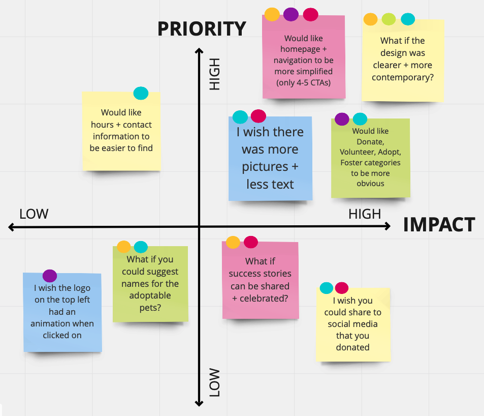
— Feature Prioritization Matrix
Evaluating priority and impact defined the features that would have the most value.
To clarify our next steps I sorted the data we had analyzed on this matrix. Then we used a silent dot voting method to decide what features to focus on:
simplifying the homepage and navigation
creating a clearer and more contemporary design
— User Insight
“Animal-lovers need a spacious experience because opportunities at the humane society inspire action.”
This insight represents the research collected and understanding of our user, Andrea. It clarified who is visiting the Austin Humane Society website and what they need. It also tells us why what we are designing is so important.
3. Ideate
To envision Andrea's journey with the humane society I created a storyboard. Then to begin understanding how she interacts with the website we drew out sketches. Afterward, I made a diagram of the four main user task flows that people look for.
— Storyboard
Andrea’s story illuminated her journey and inspired me to connect with her process.
I created this visual narrative to see her experience with our product over time.
This gave me memorable insights to consider about her decision-making process and actions.

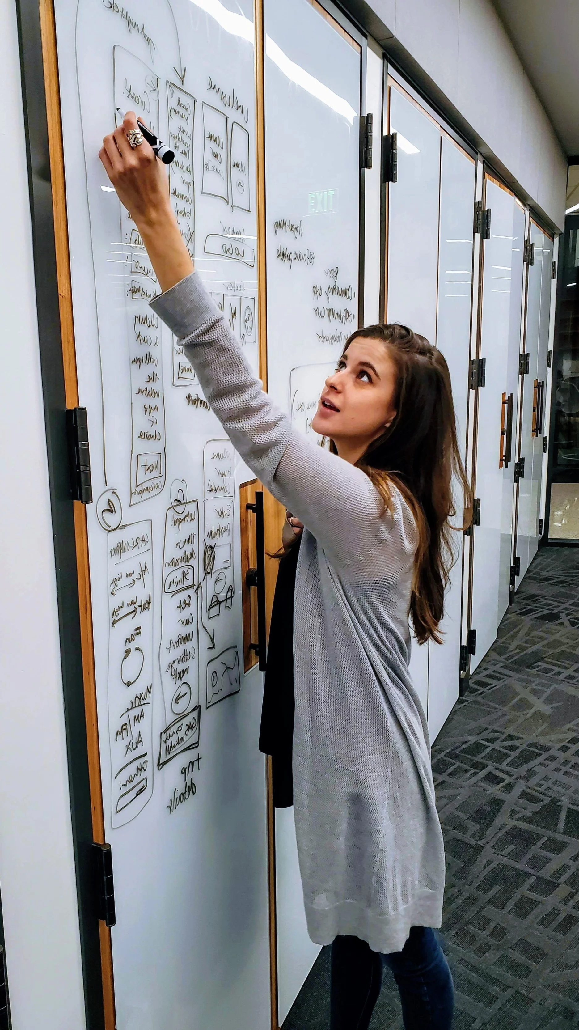
— Sketches & Wireframes
To brainstorm and illustrate our ideas we drafted our user flow and wireframes.
The user flow diagram expressed to us how each page would accomplish a task.
Sketching wireframes provided the structure to begin drafting low-fidelity mockups.

User Flow diagram

Adoption wireframe sketch

Donation wireframe sketch

Homepage wireframe sketch
— User Task Flow
The user task flow diagram served as a blueprint for our design.
By outlining out each action of the flow I was able to keep my focus on supporting clear navigation.
Each step signifies a page or decision to achieve the desired outcome.

Task Flows: Adopt, Donate, Foster, Volunteer
4. Prototype & Test
Using our user flow and sketches I created low-fidelity mockups. Then, I created a spacious experience by focusing on testing and iterating the navigation. Expanding on what I learned, we created a final high-fidelity prototype.
— Low-Fidelity Mockups & Testing
Homepage
My goal was to highlight the four task flows: Adopt, Donate, Foster, Volunteer.
I wireframed the flows with a ‘Donate’ button in the navigation and below the hero image. Testing showed that users opposed the buttons for images of ‘Featured Pets’.
First iteration:
task flows in the navigation menu
task flows as additional buttons
Second iteration:
no task flow buttons
created ‘Donate’ bar under the hero image
added ‘Featured Pet’ section

Original Austin Humane Society homepage

Users preferred having a ‘Donate’ bar and ‘Featured Pets’ section
Primary Navigation
When testing the original homepage people said the navigation menu wasn't clear.
Sections were vague with 'Get Involved' and 'Resources' rather than 'Volunteer' and 'Foster'.
First iteration:
placed ‘Donate’ as a button in menu
Second iteration:
listed ‘Donate’ as a menu section
added ‘Search’ bar

Original Austin Humane Society primary navigation

Users preferred having a ‘Search’ bar and the ‘Donate’ button in the menu
Secondary Navigation
The original navigation listed each section’s content in a single downtown column. In A/B testing users preferred seeing the entire site’s navigation options in one block of content.
They expressed that they could find what they needed faster.
First iteration:
navigation section’s content in single column lists
Second iteration:
all navigation content visible in one dropdown list

Original Austin Humane Society secondary navigation

Users preferred the dropdown navigation in one block over individual columns
— High-Fidelity Prototype
Using our research, definition, ideation, and testing, we created a final high-fidelity prototype.
Press play to watch the website prototype as a video
— Reflections & Future Iterations
Based on research, Andrea Torres would find information on adoption easy and enjoyable.
What I loved:
I thrived in designing the user task flow and page architecture. Understanding Andrea's story and needs helped me create and visualize goals. Sketching and wireframing gave structure to solve navigation issues.
What I learned:
In our design process, I saw the importance of prioritizing value to guide our decisions. These insights helped define what actions would most impact the users' needs.
What I would do next:
To make the experience more delightful I would love to continue refining the UI. We emphasized effective navigation but our elements lack consistency. I would clarify this by creating a style guide with a set of design standards.