

Oak & Thread
Original E-commerce Microsite Design
— Overview
This original brand is a microsite designed to be a subset of Target Corporation. As the Project Manager of a team of five, I directed and collaborated in the creation of Oak & Thread.
Our goal was to design a seamless purchase process from sign up, or login, to check out. We designed this with a system of three primary flows developed and tested for web and mobile products:
User flow #1: logging in or creating an account with verification questions
User flow #2: search, select or favorite an item, and proceed to checkout
User flow #3: during checkout show an error modal and guide user to resolving the issue
My Roles
Project Manager
UX Designer
Information Architect
UI Designer
The Team
Rio Bell
Grady McGee
Lauren Boone
Beto Diazrivera
Megan Gloetzner
Our Tools
Adobe XD
Photoshop & Illustrator
Invision
Miro
— The Problem
Purchasing furniture online can be overwhelming as people usually prefer seeing pieces in-person. Because this is an unusual e-commerce purchase the experience needs to be effortless.
“How might we provide a frictionless online shopping experience furniture shoppers?”
— The Solution
Simple and efficient = more motivation and excitement in completing furniture purchases online.
Consumers will feel more ease purchasing from Oak & Thread with three clear user flows:
sign up / log in
search and select
checkout with items
— The Process
1. Empathize
Heuristic Evaluation
Ethnographic Observation
Survey & Interviews
2. Define
User Persona & Empathy Map
Affinity Diagram
User Insight
3. Ideate
User Journey Map
User Flow
Sketches & Wireframes
4. Prototype & Test
Usability Testing
UI Style Guide
High-Fidelity Prototype
1. Empathize
To empathize with people's current usability issues I conducted a heuristic evaluation. Then I used a survey and interviews to gather quantitative and qualitative data. Afterward, we made ethnographic observations to see people's natural interactions in furniture shopping.
— Heuristic Evaluation
Measuring target.com for usability issues allowed me to understand current pain points.
Evaluating the website's contents provided an inventory of what we needed to correct:
inconsistent branding
overwhelming product filters
lengthy checkout process

Click to open file in a new window
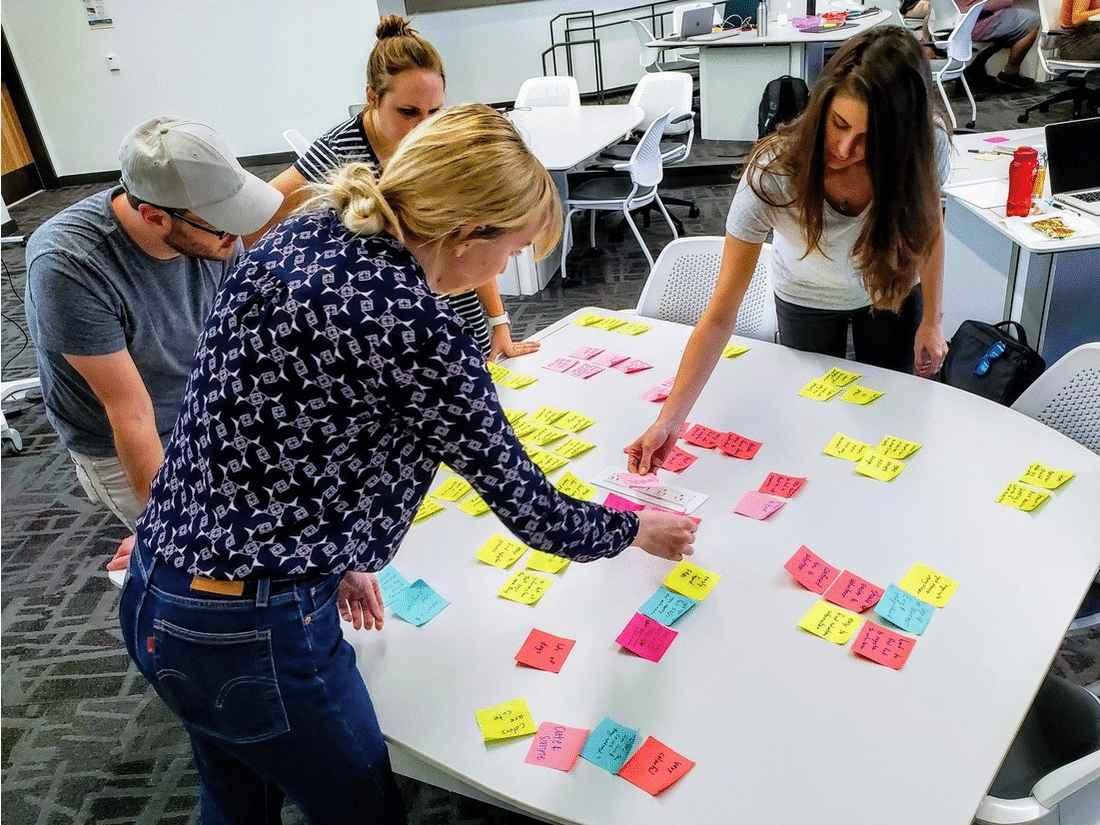
— Ethnographic Observation

Click to open file in a new window
User Prompt: You need a new end table for your living room and you want to buy it online. Your budget is $150/$200.
We observed users’ instinctive behaviors navigating furniture shopping with a prompt. This gave us key insights into what we need to build a successful product:
filters and search should always be visible
the search bar and product filters serve different purposes
people want suggestions for other products
— Survey & Interviews
To discover our user I conducted a survey and interviews. This helped me define demographics, preferences, and considerations shopping.
6 User Interviews | 570 Survey Respondents
I learned that a majority of people research and buy furniture online. They also take into consideration many factors for each purchase.
This confirmed the importance of creating a clear and intuitive product.

2. Define
I discovered our user by creating a user persona & empathy map. Then we created an affinity diagram to sort out the data we collected. With that I found an important user insight to guide our design process.
— User Persona & Empathy Map
User Persona
Here I met Lori Sanders. Knowing more about who she is helped me relate to what inspires and affects her.
This overview of her character guided future decisions on the product's design.


Empathy Map
To empathize with Lori on a deeper level I envisioned a map of what she says, thinks, feels, and does.
These thoughts and actions helped me understand the complexities of her shopping experience. I continued forward in the design process by connecting with this mindset.
— Affinity Diagram
With all the information collected we grouped ideas by identifying themes and patterns.
Each category we discovered gave us valuable direction into the features we would create. With this we were able to understand what furniture shoppers need and want.
This helped us evaluate and prioritize our focus.


— User Insight
“A practical shopper needs an effortless experience because buying furniture online is stressful.”
This insight captures in a sentence everything we had discovered and learned. It represents our persona, Lori, and brought us into the ideation part of the design process.
3. Ideate
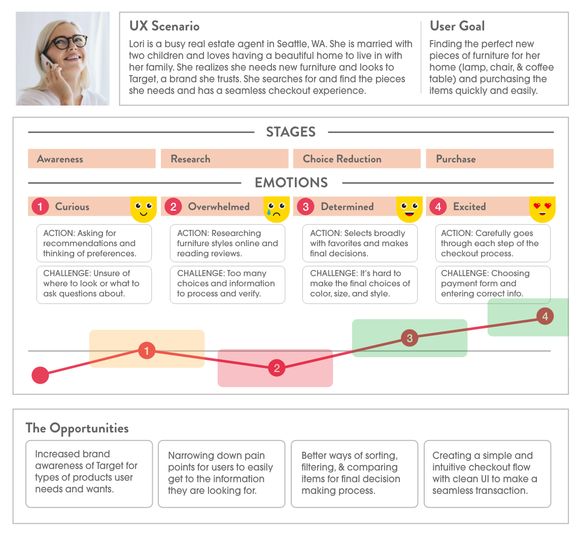
To visualize Lori's furniture buying process on Oak & Thread, I created a user journey map. Then I drew out her shopping steps with a user flow diagram. Afterward, we began to brainstorm the product’s design with sketches and wireframes.
— User Journey Map
With this map, I charted the story of Lori’s experience.
This overview of her relation to Oak & Thread is from knowing nothing of it to purchasing on the website.
With a snapshot of her daily life and goals, I can organize and depict her stages and emotions.
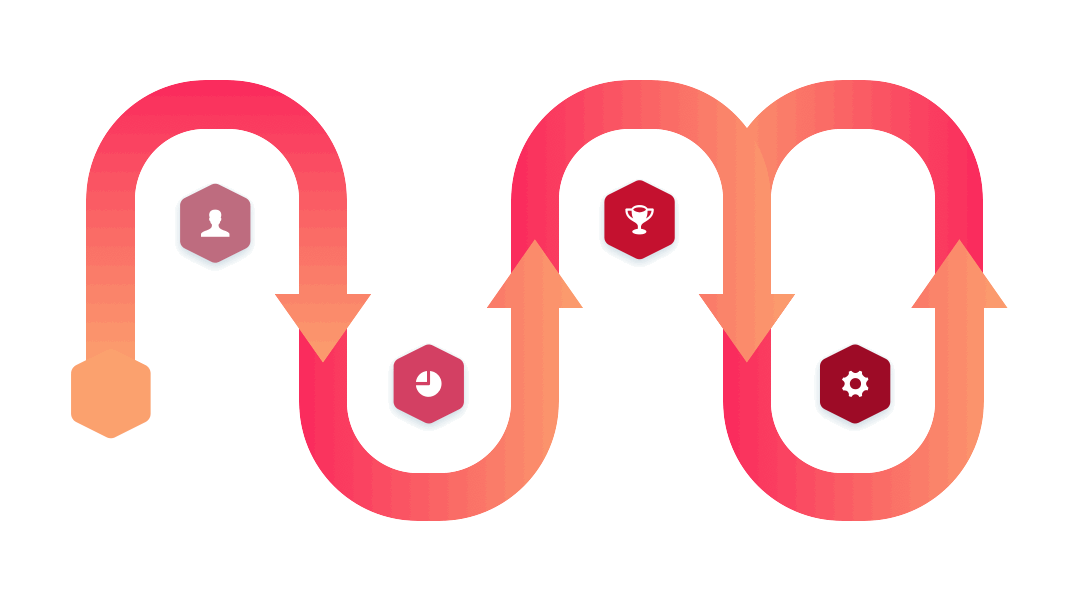
— User Flow
Lori has 3 tasks to reach her goal.
Using our research and connecting to each stage Lori takes in her journey, I mapped out a diagram of actions.
Each color serves as a blueprint of the task flows needed:
search and select
sign up / log in
checkout

— Sketches & Wireframes
With each page defined in our user flow, we drew sketches and wireframes to brainstorm structural ideas.
Then we created a complete visual representation with a low-fidelity clickable prototype. We made this in InVision to use for testing and iteration.

Mobile wireframe sketches

Website wireframe sketches
4. Prototype & Test
With low-fidelity prototypes in hand, I began A/B usability testing. This pointed out important corrections for the high-fidelity prototype. Afterward, I defined a UI style guide for consistency across the designs.
— Usability Testing
Low-Fidelity A/B Tests
I had users compare two versions of the same webpages to decide which was the better experience.
For this page people preferred:
the words ‘Sign up’ and ‘Sign in’ over ‘Login’ and ‘Create an Account’
the ‘Sign in’ section on the right
a progress bar representation

Users chose the design on the right depicting a progress bar
High-Fidelity Iterations
While testing the high-fidelity prototype users opposed the 'Added to Favorites' modal. They commented that the pop-up window and grayed-out screen was annoying to exit.
I then produced an iterated version with a heart next to the item name which turns red when favoriting. After further testing, this change was well-received and admired.
High-Fidelity usability testing

Users preferred the favoriting action on the top where the heart turns red
— UI Style Guide
This style guide communicates the design standards of Oak & Thread.
To ensure consistency and best communicate our brand I established the following elements. Notice the homage to our parent company, Target, with their signature red color.


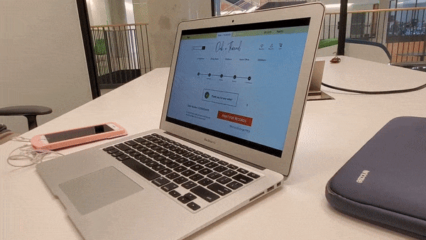
— High Fidelity Prototype
With our research, definition, ideation, and testing, I created a final high-fidelity prototype.
Press play to watch the website prototype as a video
— Reflections & Future Iterations
I know Lori Sanders would find Oak & Thread to be a delightful furniture shopping experience.
What I loved:
My favorite part of designing this product was digging deep into our research. With this collaborative analysis, I felt I connected with our user base and persona, Lori. Especially during the ideation process when I expanded on her scenario and journey.
What I learned:
Throughout this process, I saw the significance of testing and iterating prototypes. Each time I sat down with someone to review and test, it illuminated essential changes to make. Seeing the impacts it made in the design from wireframes to high-fidelity gave me a lot of confidence in the process.
What I would do next:
I see opportunities to reexamine the architecture and wireframes of the pages created. From the user flow diagram to the low-fidelity mockups, I would want to do more usability tests at each step. This would clarify any issues later than may be difficult to see in high-fidelity.